
Your Logo Doesn’t Need To Be Clever
Your logo doesn't need to be clever.
It needs to be repeated until nobody needs your name next to it.
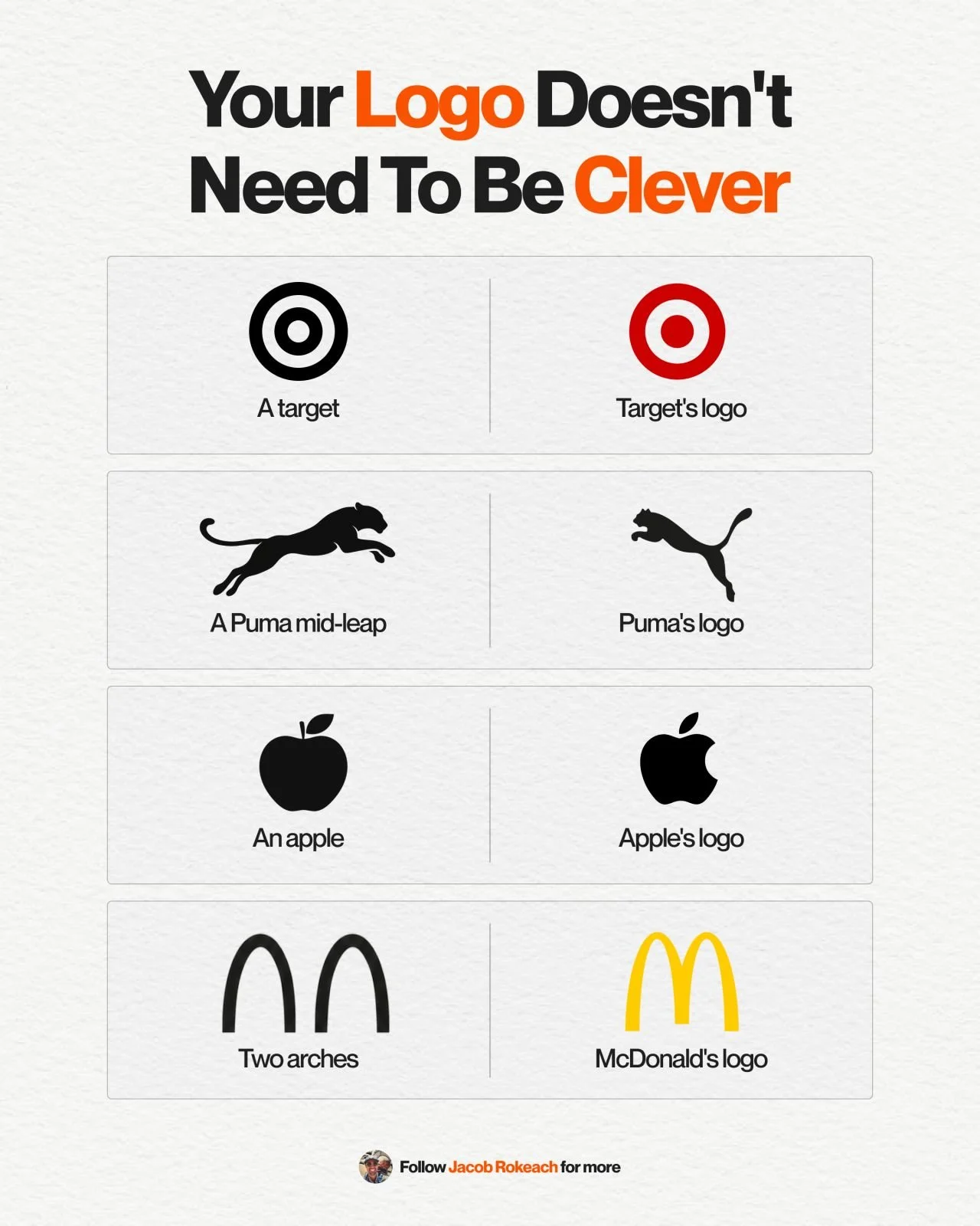
Target's logo = a target.
Puma's = a Puma mid-leap.
Apple's = Apple with a bite taken out.
McDonald's = 2 arches that look like an M.
Not a single, crazy, 'outside the box' idea there.
The logo is literally the brand name.
And it's that simplicity that made it work.
Just a shape so basic your brain can store it without even trying.
Because obviously when you see an Apple... you'll think of Apple?
Same goes for Puma and any one of these brands.
That's it. That's the entire design brief.
Yes, I know this makes it sound easy.
A lot of creative teams still get it wrong anyway.
They spend months trying to design a logo that says something on its own.
Meanwhile, the brands that win at this keep it so simple that nobody has to think twice.
Simple enough to recognize instantly.
That's the whole test for whether a shape becomes a brand.
So before you brief another logo refresh, ask yourself this:
Are you trying to make it smarter, or are you trying to make it simple enough that people instantly recognize it without your name next to it?
♻️ Repost if you've sat through a logo debate that missed the point completely.
And follow me, Jacob Rokeach, for more on brand and creative systems that scale.