
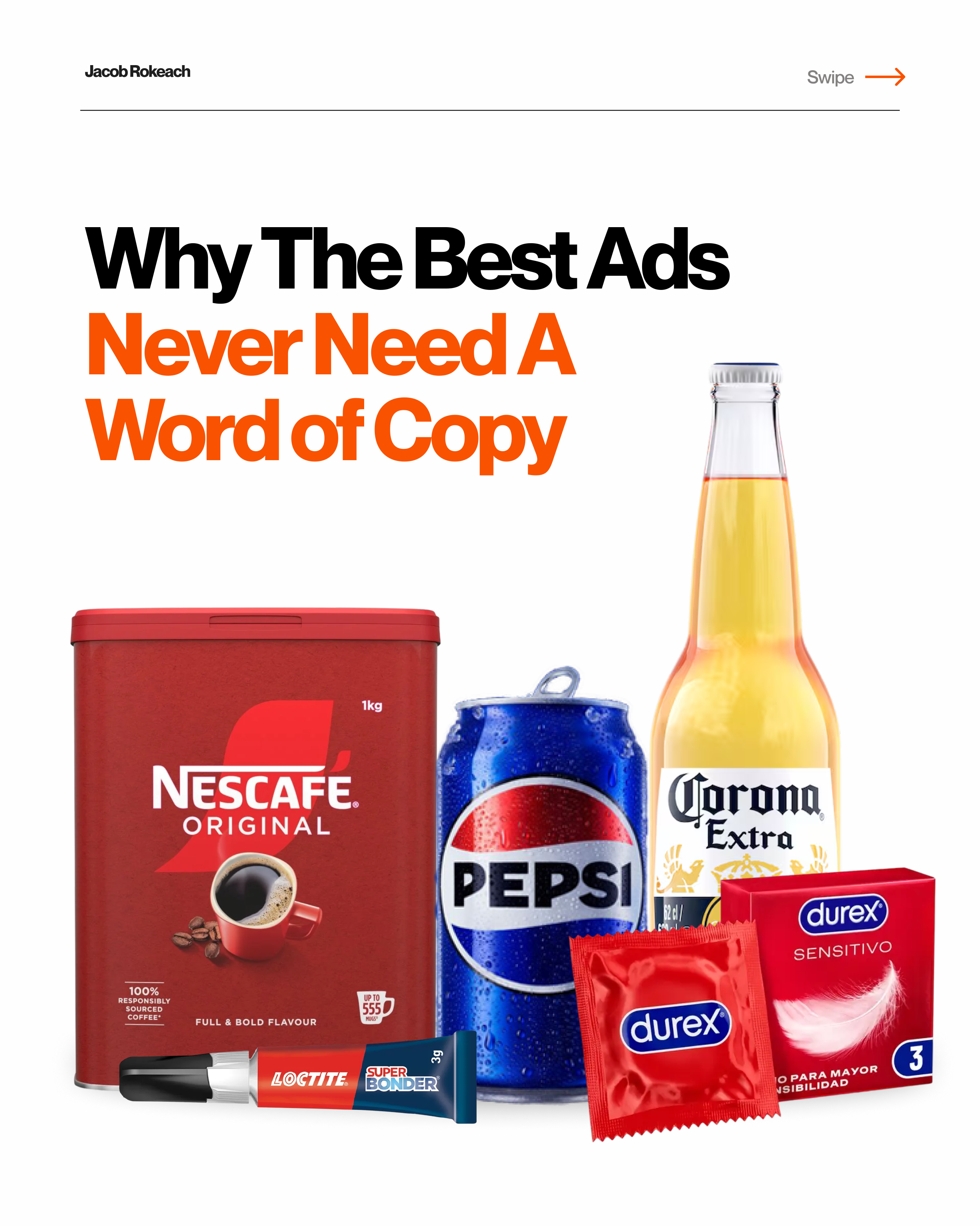
0 of these ads needed a paragraph to make their point.
1 image did the whole job.
The more words an ad needs, the less confident it is in its own idea.
If the visual already makes the point, copy just slows people down on their way to it 🤷
These 5 prove exactly that 👇
1️⃣ Durex
Durex put a condom next to a baby bottle nipple.
2 words underneath: "You decide."
No explanation.
Because you know, if you don't use their product... that's the outcome 🤣
2️⃣ Pepsi Halloween Ad
Pepsi dressed a Coke can in a Pepsi cape for Halloween.
Captioned it "We wish you a scary Halloween."
They turned their biggest rival into the punchline, using Coke's own packaging to do it.
Didn't cost them a single dime to make Coke part of the joke.
That's the kind of exposure a lot of brands would pay millions for,
and Pepsi got it for free just by pointing at the brand next to them.
3️⃣ Nescafé
Nescafé filled an entire ad with the letter Z.
Rows and rows of it, like static on a screen.
Then, right at the bottom, the Zs turn into Ns and spell out "Nescafé."
Your eyes glaze over reading it, exactly like the tiredness the ad's about.
Then the brand snaps you out of it, just like their coffee does.
That's the whole ad, telling you what their product does, without a single WORD of copy.
4️⃣ Corona
Corona built a billboard and let living plants grow up the side of it.
"Made from the natural world."
They let something living grow on the billboard itself,
so the proof happens right there instead of trying to make you believe it.
5️⃣ Loctite
Worth flagging with this one: it's a viral concept ad, not something Loctite itself ran.
But it doesn't make the idea any less clever.
(They probably should have stolen it 🤣)
It uses a royal family photo with a tear running straight through it, right where Harry and Meghan would be.
Underneath: "Fixes Everything."
One rip down the middle of that photo, right where the 'feud' is, not only is a great joke.
But again, tells you what the product does, with ZERO copy.
With all 5 of these, no one had to read 3 sentences to get the joke.
The image does the explaining; the copy just closes it out.
That's a much harder thing to pull off than a clever headline.
A headline needs your attention.
A visual like this rewards it instantly.
Which one of these took you the least time to get?
♻️ Repost if you got the joke before you read a single word of copy.
And follow me, Jacob Rokeach, for more on creative work that says more with less.
why the best ads never need a word of copy
Previous
Previous
the 5 people you need in your circle
Next
Next