
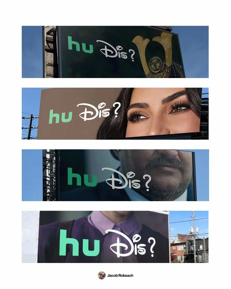
It takes decades to build a logo you can cut in half.
Disney just put theirs on a billboard to prove it.
The new campaign mashes the "hu" from Hulu's logo with the first half of The Walt Disney Company's to ask a question we've all texted at some point:
"hu Dis?"
The goal is simple:
Remind people they can now watch Hulu shows on Disney+.
(Yes, literally THAT simple)
Pair that with a tight crop of Kim Kardashian's eyes, and you've got a billboard that explains a whole product change in 2 words.
As someone who spent time at Hulu, I loved this one.
Here's why it works:
1️⃣ They played with a logo people know by heart
↳ Even half of Disney's logo is instantly recognizable.
↳ A newer brand trying this would probably just confuse people.
2️⃣ It says 1 thing
↳ The entire message is "Hulu is on Disney+."
↳ Nothing else on the board competes for your attention.
3️⃣ It borrows language people already use
↳ "Who dis?" is something people text every day.
↳ There's nothing new to learn, so the joke clicks instantly.
4️⃣ The image finishes the joke
↳ A cropped face next to "who's this?" = no extra copy needed.
↳ It's the kind of joke you get in less than a second and still think about later.
Big brands protect their logos for good reason.
But once yours is recognizable enough, having a little fun with it can make people look twice.
What's the one thing people instantly recognize your brand for?
♻️ Repost if this billboard made you smile too.
And follow me, Jacob Rokeach, for more on brand and creative systems that scale.
4 Brand Marketing Lessons From Disney's Hulu Billboard Campaign
Previous
Previous
why the best ads never need a word of copy
Next
Next