
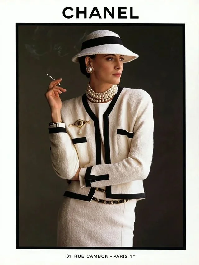
Chanel could scrub its logo off a 40-year-old ad.
And you'd still know exactly whose it was.
Someone posted 18 vintage Chanel ads on Reddit recently, literally just admiring them.
I went through every single one, logo cropped out of view.
And they all still looked unmistakably like Chanel.
That's 40 years of repeating the same look, on purpose.
And it got me thinking...
How many brands today could survive that same test?
My answer: barely any.
So I went back and picked apart exactly what Chanel never let slip.
Here's what never moved, no matter the decade:
1️⃣ The tailoring stayed the same.
Structured shoulders, cropped jackets, decade after decade.
2️⃣ The color palette stayed the same.
Tweed, black and white, with one bold color reserved for a single statement piece per look.
Every choice deliberate, never decorative.
3️⃣ The mood never shifted to chase a trend.
Clean, controlled, a little detached, whether the ad ran in the 1980s or last year.
Take the name off the page, and the clothes still snitch on who made them.
A lot of other DTC brands can't say that.
Because they change their entire look every campaign.
New fonts, new palette, new mood board every time, just to feel fresh.
That's a brand starting from 0 every quarter instead of building on what people already recognize.
Chanel skips that problem completely.
Strip the logo, and the clothes and the mood still give it away.
Would your brand pass the same test?
If you want a look that people recognize before they see your name on it, let's talk.
Book a free consult, and we'll show you what that could look like for your brand: https://lnkd.in/dD6SNFen
♻️ Repost if you've ever clocked a brand before you saw the name.
And follow me, Jacob Rokeach, for more on creative systems and brand identity that lasts longer than a rebrand cycle.
Brand Consistency: How to Build a Recognizable Brand
Previous
Previous
the best psychological triggers to use in marketing
Next
Next