
The Psychology of Typography for Brands
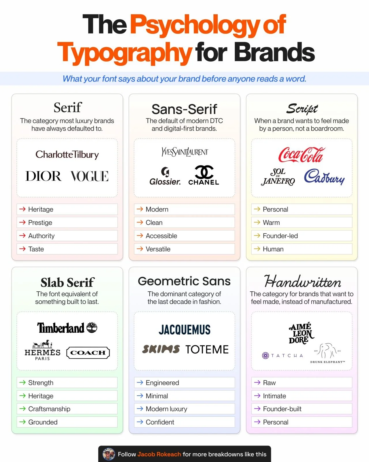
You have 0.05 seconds before someone judges your brand.
Your font makes that call before your copy gets a chance.
Working across consumer brands, an overlooked decision I see in beauty, skincare, and fashion is typography.
Your font tells someone if your brand is luxury or accessible,
heritage or modern, premium or playful.
All before they read a single word.
And nowadays, so many brands are reverting to basic, that it's hard to stand out at all.
80% of founders pick a font because it looks good.
But the brands that scale pick fonts because of what they signal.
Here's what every major font category is doing for the brands that have figured this out 👇
1️⃣ Serif
↳ Signals: Heritage, prestige, considered taste
↳ Brands: Vogue, Dior, Charlotte Tilbury
Serif fonts have been signaling luxury for centuries.
If you want to be taken seriously in beauty or fashion, this is the safest starting point.
2️⃣ Sans-Serif
↳ Signals: Modern, clean, accessible
↳ Brands: Glossier, Chanel, Saint Laurent
The default of modern DTC.
Easier to read, easier to trust, easier to scale across every touchpoint from packaging to app.
3️⃣ Script
↳ Signals: Personal, warm, founder-led
↳ Brands: Coca-Cola, Sol de Janeiro, Cadbury
Script fonts feel human,
Like the name was written by hand rather than designed.
4️⃣ Slab Serif
↳ Signals: Strength, heritage, craftsmanship
↳ Brands: Hermès, Honest Beauty, Sunday Riley
Slab serifs carry weight and durability.
They read like something built to last and work when a brand wants to signal quality you can feel.
5️⃣ Geometric Sans
↳ Signals: Engineered, minimal, modern luxury
↳ Brands: SKIMS, Jacquemus, Toteme
The dominant category of the last decade in fashion.
Says "we don't need to say much" and lets the product do the work.
6️⃣ Handwritten / Signature
↳ Signals: Raw, intimate, founder-built
↳ Brands: Drunk Elephant, Tatcha, Aimé Leon Dore
The font for brands that want to feel personal, like someone signed their name to it.
Works when the founder is the brand and the story is part of the product.
The same font can build one brand and break another.
A luxury skincare brand using a playful script.
A streetwear label using a Didot serif.
Both are sending a signal that fights against everything else they are trying to do.
Most founders never think about this until they hire a brand designer and realize their logo has been telling the wrong story for 3 years.
So, before you pick a font because it looks nice,
Ask what it says about your brand before anyone reads a word.
That signal is already working.
The only question is whether you chose it on purpose.
What font category does your brand use?
♻️ Repost for a founder rebranding right now.
Follow me Jacob Rokeach for more breakdowns like this.