
Psychology of Shapes
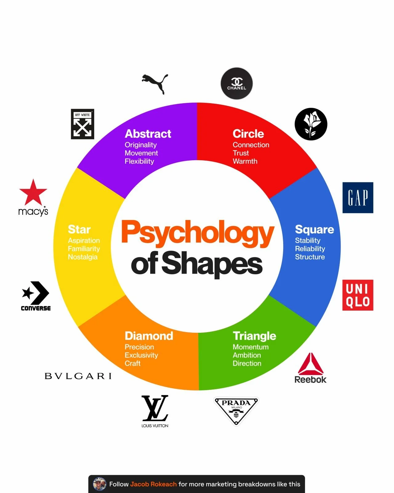
The best brands design with psychology in mind.
But the smartest ones design for perception.
Being remembered doesn't mean being trusted.
Perception does the heavier lifting.
And nowhere does that play out faster than in a logo.
Before anyone reads the name, they've already read the shape.
Shape registers in the brain as pattern, and your brain processes pattern faster than it processes words.
That's why the outline lands before the name does.
Once you know this, you can't unsee it.
Especially across retail, beauty, and fashion, where the logo is doing half the selling before the product even shows up.
Here's the breakdown and what it might already be saying about your brand:
⭕ Circles and ovals
Reads as trustworthy and warm, easy to buy from without a second thought.
Chanel's double Cs form one soft loop, no corner for your eye to escape at.
👉 Want your brand to feel approachable? A circular mark helps for free.
◼️ Squares
Feels solid and reliable, like it's not going anywhere.
Gap's plain navy square has worked for decades.
Straight lines and even angles feel ordered, like nothing is left to chance.
👉 A square is an easy way to feel dependable before anyone reads your reviews.
🔺 Triangles
Feels like movement, like it's already headed somewhere.
Reebok's vector logo looks mid-sprint; a point in one direction reads as forward motion.
👉 If your story is about progress, a triangle says it without a tagline.
⭐ Stars
Feels aspirational with a bit of borrowed nostalgia,
Stars lived on badges and varsity jackets long before logos did.
Converse turned one into a casual fashion icon.
👉 Want instant familiarity without decades of history? A star shortcuts it.
💠 Diamonds
Feels expensive and precise, like craft.
Louis Vuitton's monogram is basically covered in tiny diamond shapes.
Not soft or round, cut like a gem on purpose.
👉 A cut, angular logo feels expensive before anyone sees the price tag.
✳️ Abstract shapes
Feels original and like it refuses to sit still.
Off-White skipped the symbol completely and just went full diagonal stripes instead.
👉 If you're built on being different, an abstract mark can't be compared to anything.
None of this means every hype brand needs a triangle or every luxury brand needs a diamond.
Branding is way more nuanced than a shape chart on the internet.
What it does mean is nothing about your logo is neutral.
Someone picked that shape, and it's already doing work on your customer before your product does.
At Fluency, half the growth conversations we have start with a brand assuming their creative is fine because nobody's complained about it.
Shape is one of the smallest levers in that whole system, and one of the easiest ones to get wrong without even realizing it.
What is your logo telling people, whether you meant it to or not?
♻️ Repost for a founder who picked their logo based on vibes.
And follow me, Jacob Rokeach, for more on growth in retail, beauty, and fashion.