
Color Psychology For Brands
0.05 seconds.
That's how long someone takes to decide if your brand is worth watching.
Most teams treat color as a designer call.
They pick one that looks good and fits the mood board.
What gets missed is how the feed reads it before anyone else does.
Because color triggers an emotional response before any customer reads a word.
That response either works for your brand or against it.
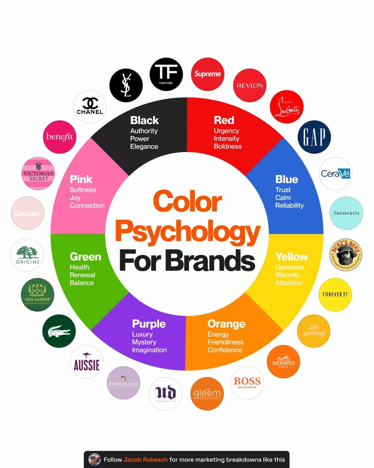
Here's how each color reads:
🔴 Red
→ Urgency
→ Intensity
→ Boldness
🔵 Blue
→ Trust
→ Calm
→ Reliability
🟡 Yellow
→ Optimism
→ Warmth
→ Attention
🟠 Orange
→ Energy
→ Friendliness
→ Confidence
🟣 Purple
→ Luxury
→ Mystery
→ Imagination
🟢 Green
→ Health
→ Renewal
→ Balance
💗 Pink
→ Softness
→ Joy
→ Connection
⚫️ Black
→ Authority
→ Power
→ Elegance
The color category changes the read entirely.
If every brand in your space uses green,
green stops signaling health and becomes repetitive instead.
Sometimes the right call is to break the category default.
Before you lock in a palette, ask 3 questions:
- What emotion should someone feel before they read a single word?
- What colors already own your category?
- Does this color carry the right signal at the size and speed it appears in feed?
Color is a strategic decision.
Treat it like one.
What color is your brand, and was it a deliberate decision?
♻️ Repost to share this with a founder or creative director in your network.
Follow me, Jacob Rokeach, for more on building creative systems that perform at scale.